

Story Of Ritmate:
Conceptualization:
In the bustling world of fitness, Ritmate emerged with a vision to redefine wellness through rhythm and movement. The founders envisioned a fitness company that seamlessly blends modernity with a sense of reliability and quality.
Typography Selection:
The journey begins with the choice of fonts. Poppins and Nexa were carefully chosen to reflect the dynamic and contemporary nature of Ritmate. Poppins brings a friendly and approachable vibe, while Nexa adds a touch of sophistication, symbolizing the professionalism and expertise that Ritmate brings to the fitness industry.
Crafting the Logo Icon:
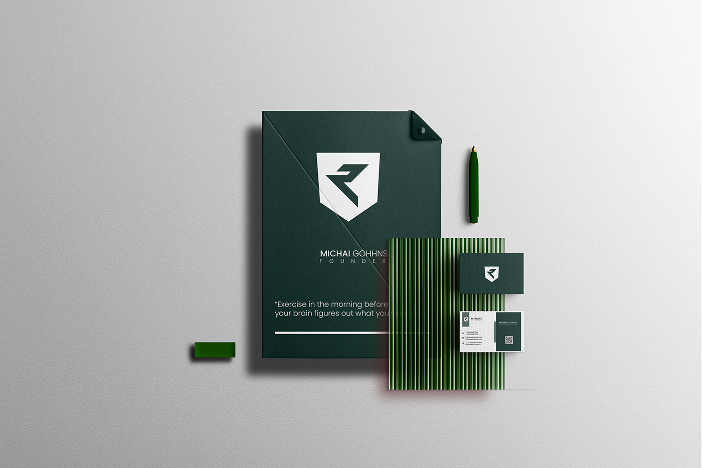
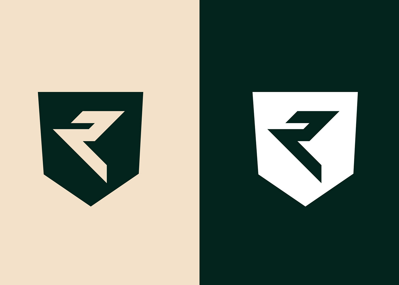
To encapsulate the essence of Ritmate, a unique icon was born. The icon represents a fusion of kinetic energy and balance. It subtly forms the initials "R" and "F" for Ritmate Fitness. The flowing lines convey motion and rhythm, emphasizing the fluidity and harmony that Ritmate seeks to instill in its fitness programs.
Color Paletten:
The color palette was chosen with great care. A vibrant combination of energetic orange and deep blue symbolizes the vitality and trustworthiness associated with Ritmate. These colors evoke a sense of passion, commitment, and reliability, making them perfect for a fitness brand.
Bringing it Together:
As the elements came together, the logo tells a story of a fitness company that harmonizes cutting-edge techniques (represented by the modern fonts) with a commitment to well-being and balance (embodied by the flowing icon). Ritmate is not just a fitness brand; it's a lifestyle that combines innovation, expertise, and a holistic approach to health.
Unveiling the Logo:
The logo was unveiled to the world with an event that celebrated the fusion of technology, fitness, and wellness. Attendees felt the pulsating energy of Ritmate's philosophy as they witnessed the logo come to life on screens and merchandise.
Impact:
Since its introduction, the Ritmate Fitness logo has become an emblem of inspiration and motivation in the fitness community. It's more than just a visual identity; it's a symbol that echoes the spirit of a community committed to embracing a healthier and more balanced lifestyle.
In this narrative, each step contributes to the overall story of Ritmate Fitness, making the logo not just a visual representation but a reflection of the brand's ethos and journey.
Thank you.


Thanks
For Watching


